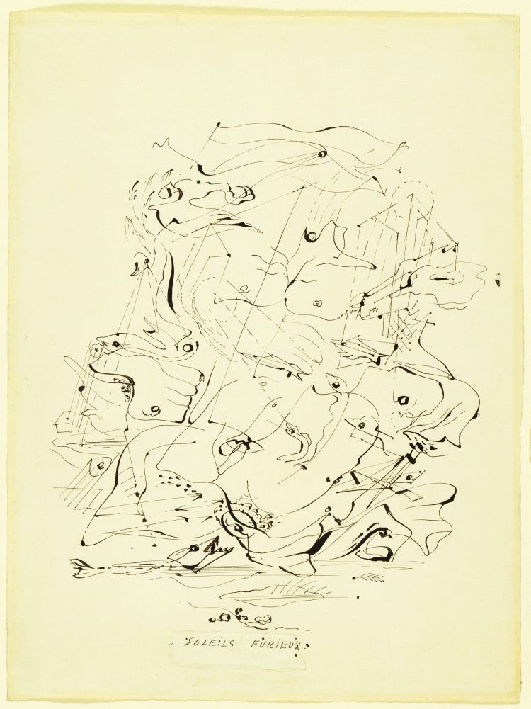
These are my final images for my project. Some of them I have reviewed before, so those I will just use those reviews and a reason as to why I chose them.

I like the above image purely because of the repetition it provides. Taken on a Mamiya RB67 with a 50mm lens (equivalent to 28mm with a 35mm camera) which is a wide angle, and this provides many lines in the roof tiles. A very low f/ stop accounts for the low depth of field. I wish I could say this was completely natural, but I did have to play around with photoshop slightly; I upped the saturation slightly (only a couple of percent) and sharpened the image using a high pass filter.


This is another image that I spoke about earlier, but have changed to black and white. I think the black and white makes the image a lot more contrasty, which gives even more of a feel of texture to the image.

I really like this image. All the lines point to the right hand side of the image, and when viewed from far away, or a smaller image, an arrow is clearly visible. Chiaroscuro is a key compositional element in this image. I did try this image in black and white, but it lost something in the transition, something which I can't quite put my finger on. There are not just the lines which create the 'arrow', but there are strong vertical lines in the bridge stanchions.

This is an image from Portugal; I like, and have chosen it, purely for the aesthetics behind the image. As I said about an image from my second attempt, images like this give across a sense of peacefulness. It could almost be used as an advertisement for the area it was taken in, to promote tourism. The image was taken on my Nikon D7000 at ISO100, f/8 and 1/250th of a second. It was taken at a wide angle, which is why the trees all seem to point inwards.

This is another from Portugal, but taken on my RB67; if I remember correctly, the settings were between f/8 and f/11 (but the distance accounts for the small depth of field) and around 250th of a second. I had to bring the exposure up in photoshop as it was very dark due to underexposure; I feel the fault in the lens I described in an earlier post may have had something to do with this though. The flower is almost the only item in the photo due to the exposure and the depth of field, so there isn't much else to focus on, apart from a few spots of yellow at the bottom of the image.

I like the above image purely because of the repetition it provides. Taken on a Mamiya RB67 with a 50mm lens (equivalent to 28mm with a 35mm camera) which is a wide angle, and this provides many lines in the roof tiles. A very low f/ stop accounts for the low depth of field. I wish I could say this was completely natural, but I did have to play around with photoshop slightly; I upped the saturation slightly (only a couple of percent) and sharpened the image using a high pass filter.

I did write about this image after my first attempt at Automatic Photography, but I changed it to a monochrome photo after playing around on photoshop. I feel the change has made the image much more atmospheric, particularly the object creating a shadow in the laundry hamper. I also like the way the hamper almost glows due to diffusing light.

This is another image that I spoke about earlier, but have changed to black and white. I think the black and white makes the image a lot more contrasty, which gives even more of a feel of texture to the image.

I really like this image. All the lines point to the right hand side of the image, and when viewed from far away, or a smaller image, an arrow is clearly visible. Chiaroscuro is a key compositional element in this image. I did try this image in black and white, but it lost something in the transition, something which I can't quite put my finger on. There are not just the lines which create the 'arrow', but there are strong vertical lines in the bridge stanchions.

This is an image from Portugal; I like, and have chosen it, purely for the aesthetics behind the image. As I said about an image from my second attempt, images like this give across a sense of peacefulness. It could almost be used as an advertisement for the area it was taken in, to promote tourism. The image was taken on my Nikon D7000 at ISO100, f/8 and 1/250th of a second. It was taken at a wide angle, which is why the trees all seem to point inwards.

This is another from Portugal, but taken on my RB67; if I remember correctly, the settings were between f/8 and f/11 (but the distance accounts for the small depth of field) and around 250th of a second. I had to bring the exposure up in photoshop as it was very dark due to underexposure; I feel the fault in the lens I described in an earlier post may have had something to do with this though. The flower is almost the only item in the photo due to the exposure and the depth of field, so there isn't much else to focus on, apart from a few spots of yellow at the bottom of the image.


